


Totally Tourist was a short-lived startup in Savannah, GA and Hilton Head Island, SC with the goal to turn a long-lived print publication, Where to Go, into a locals’ and tourists’ destination for information on things to do, and things to buy. Where to Go would still remain a print publication, but be re-branded and have an accompanying website and app.
The main goal behind the platform was to design it with the intent to sell it to other cities: a white label app that could be customized easily.
Via a recommendation, I was brought onboard for a trial period when the developer left his position to help correct mistakes and start from scratch. The CEO had never heard of UX or UI design before, but had been working with a small team of two designers, a developer, and handful of salespeople. The app was live, semi-usable in a mostly-functioning prototype state, but it needed a lot of work and had way too many features for an MVP.
My biggest problem was communicating the UX process, since there was a learning curve for the CEO. I had to quickly find a way to integrate the UX process in the redesign, so one of my first tasks was to create a SWOT analysis and research every competitor I could find.
The Where to Go app was already live, and the initial merchants that had signed up, or were promised to be able to use the platform soon, were upset because the build had gone awry and we had no active users. Merchants were paying to have print ads created for the publication, as well as have their listing live online and in the app. There were features that were hyped up by the sales team and promised. There was a VR feature that would allow the user to hold up their phone and see deals all around them. Another feature utilized AR and the print publication so that users could scan the booklets to load deals on the app. A final feature used beacons and geolocation to nudge the user of deals nearby when they walked down the street.
Our biggest competition was well-known: LivingSocial and Groupon. But we also had local competition that had been around for a while, Savannah ePass.
In my first couple of weeks, I spent all of my time digging through the platform to try to make sense of how it was built so I could start wireframing changes. I mapped out the dashboard based on usertype: employees, merchants, and administrators.
Initially, there was lots of confusion in what the core functionality of the platform should be, so we spent a lot of time figuring out how the platform could function, then compared that to how it currently functioned.
The two designers focused on branding and graphic design for the print publication, since that was their strongest skill set. The effectiveness branding and visual design was a low priority for me compared to the functionality and usability of the platform, but I did help them out with graphic design tasks when I could.
The CEO wanted all of the features (AR, VR, geofences) to remain, but with our time crunch, and uncertainty that users would even use those features, we cut most of it out and focused on discovery, purchasing, and redeeming for users, and focused on managing the dashboard for merchants. I had no time for user research and had to go with my gut feelings—that simplifying the interface was the best, and to mimic the interface of existing similar platforms to start.
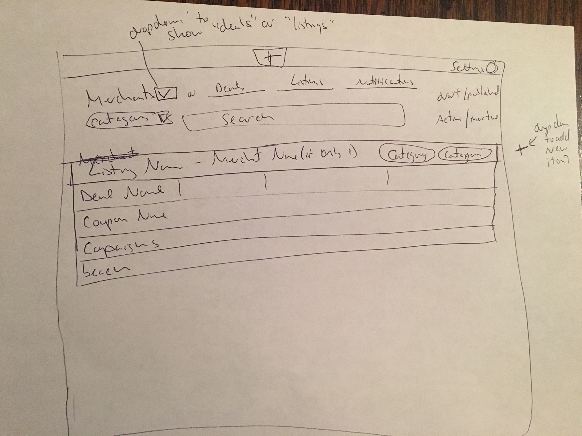
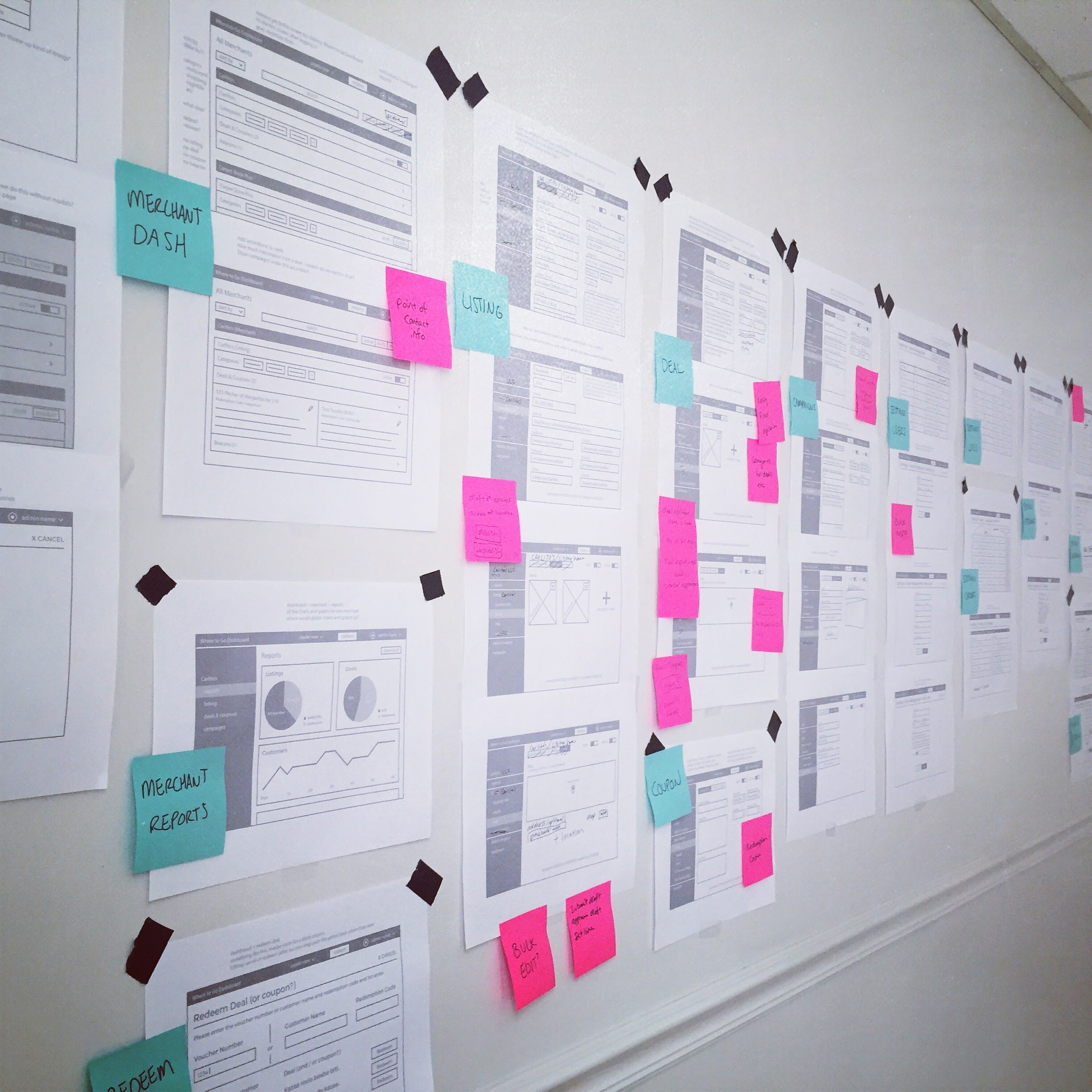
Each week, or when there were major revisions, the wireframes were printed and taped to the wall, in order of a general user flow. This way we could talk through the process and add notes on what needed to change.
Each screen was numbered, and changes to the wireframes were written down for my documentation purposes.
We designed the merchant dashboard to be accessible via the web, or tablet, but there were plans to create a phone app just for merchants, too. Unfortunately, we never got around to that stage.
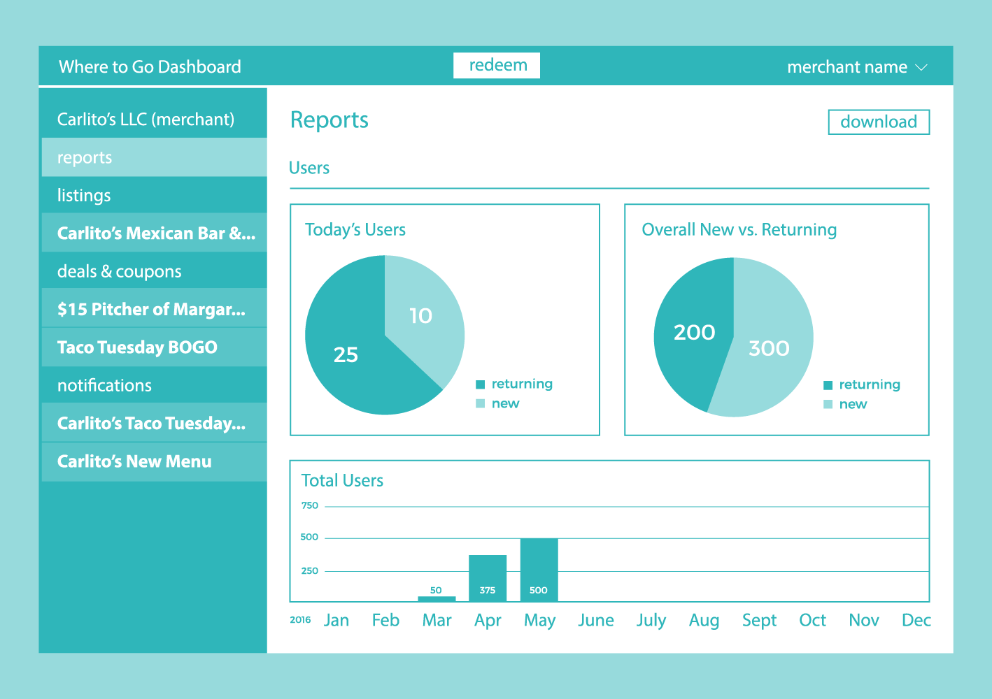
I started out with a list of user stories, and combined with the in-depth analysis of the current dashboard, I created a simplified dashboard for merchants. The main dashboard screen had useful charts and graphs that a busy shop or restaurant owner could look at quickly and see how many deals were sold versus how many were redeemed. They could also see how many views their listing has gotten, and hopefully be able to gauge that they’ve gotten their money’s worth and are marketing themselves effectively. If they wanted, they could save and print the report for their records.
Ideally if the merchant made changes to their listing or deal, the changes would automatically update online for them. But we had a system in place that only allowed the merchant’s assigned salesperson to update their listing for them, to moderate each listing and insure each listing was free of spelling errors and filled out 100%. Not all merchants were comfortable picking up new technologies, as well, and felt more comfortable working with someone to help them learn the platform—which made total sense as the original platform was not very user-friendly.
If the merchant needed to redeem a deal, all they had to do was click the “redeem” button in the top left and type in a little bit of info to match the customer with the deal. In this version of the redemption process, each user brought a printed email copy of their deal that could be handed over to the merchant, so this could be done at the time of purchase, or all in one batch later.
After several quick iterations of wireframes, we settled on a flow that allowed the user to browse a map by default, and filter the pins on the map based on categories like restaurants and fashion. We simplified the payment and deal redemption process. The new process involved the user handing the phone over to the merchant to immediately redeem the deal and hand the phone back. Only the merchant would know the redemption code, to keep the user from accidentally redeeming the deal themselves.
We dropped the AR and VR features, and were on the fence about the geofence notifications. I argued against them, since they can easily harass the user into never opening the app again and deleting it. If the user walked down the main shopping street in Savannah, they could potentially get a notification for every other store on the street, and we didn’t have time to focus on creating a healthy balance.
At the end of the 90 days, we had redesigned the merchant dashboard and the mobile app and had contracted a development company in a nearby city to build it from scratch for us.
Unfortunately, also during the 90 days, there was high turnover and a lot of stress surrounding all of the changes. I was the only designer left, and the outlook was not positive that the MVP would ever make it to market. The project switched hands was rebranded later that year as PinScout, but even then it never made it to market.
It was a tough work environment, but I learned what my limits were, and I pushed myself to get work completed to the best of my ability. If you would like to see more of my work on this project or have questions, send me an email.