UX Case Study: QuickIt
A New Way to Pay Your Parking Ticket!
I was asked to look through the Quickit app’s flow and do a UX audit to make sure it had the most seamless experience for the user. The app had already been mostly built and was in beta, while the founders sought out institutions that wanted to integrate it into their current parking systems. The startup duo, Tristan and Steven, were featured locally in several publications throughout their time pitching the app.
___
“We are proud to be the first university in the entire nation to utilize this innovative app,” said Kristi Bryant, director of Parking and Transportation. “We always aim to give our students the most convenient, secure and user-friendly means to pay their tickets and continue on with their day.”
The free app, available for Android and iOS platforms, gives users the ability to scan a ticket and pay securely with a credit card or PayPal instantly. Other unique Quickit features include push notification and payment reminders, Android and Apple support and quick payment confirmation.
All parking citations now include instructions on how to pay through Quickit, as well as directs users to download the app for either iOS or Android.
“Quickit is thrilled to bring our mobile app to Georgia Southern,” says Tristan Steele, CEO of Quickit. “Our service offers everyone including students, faculty and visitors an easier and more convenient way to pay for their parking citations that is truly beneficial to them and the University. This is our first of many rollouts in 2016, and I can’t thank the Georgia Southern Parking and Transportation department enough for all their support.”

User Flow
Getting a parking ticket can ruin your day—you just want to pay the fine and forget about it, hoping it doesn’t happen to you again anytime soon. The premise of Quickit is as simple as it gets: put in your parking ticket number, hit pay, and your card is charged. There’s no need to pay it in person or worry that your money may get lost in the mail. It’s instantly taken care of for you.
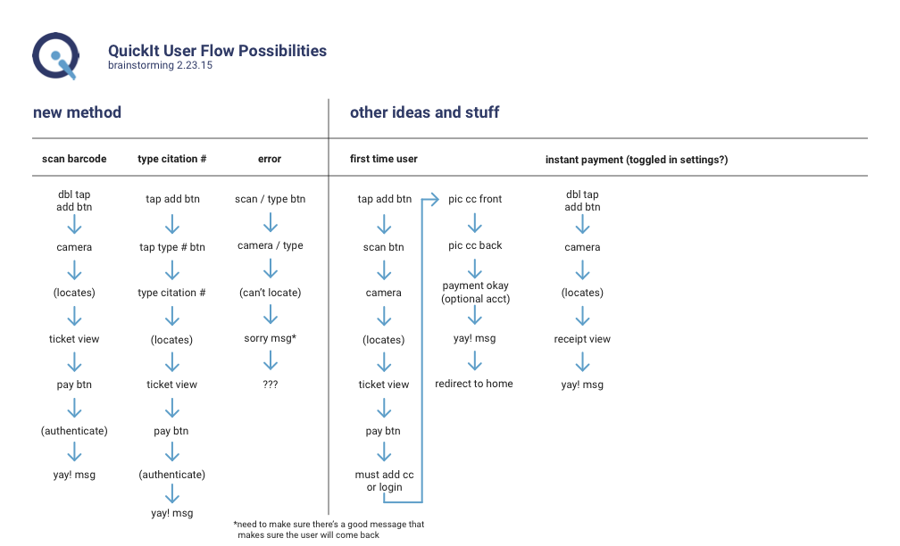
To simplify the process, the user has two options: they can scan their ticket or manually input a number. If they are a new user without an account, they will have to take a one time additional step and input their card information before finalizing payment. It may even be possible to further simplify the process and offer an instant payment method that could be toggled on, for those users that can’t seem to stop getting tickets.
Mostly, since the app was already in production with no room for huge changes, the experience needed improvement with the language used, to gently guide the user through the interface, and help them out if something went wrong.

Home Screen, Scanning a Citation
If the user does not have any pending or paid tickets, the home screen is blank (empty state), with a plus button in the bottom corner. If they tap on the button, they have their two options for adding their ticket, with emphasis on scanning the ticket.

Something Went Wrong
If the scan failed, the user has the option to scan the ticket again or they can manually input the number if it fails a second time.

Loading the Ticket
Once the ticket number is typed (or if the scan was successful), the user sees a screen with all of the same information on their physical ticket. If the information is correct, they can choose to pay later, which would add the ticket to their pending tickets list, or pay immediately, which would take them to the next step.

Login & Add a Card
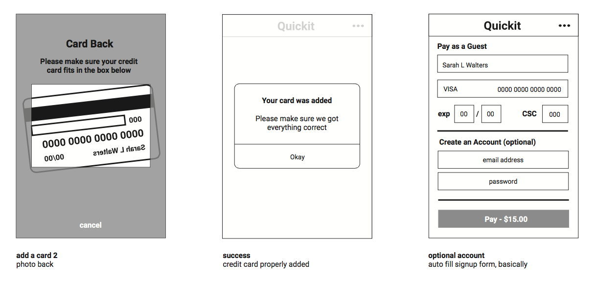
Most users aren’t likely to be using the app on a daily basis, so it’s likely they will need to log in next, to authenticate using their card. If they have never used the app before, they will create an account or pay as a guest if they don’t plan on using the app ever again, but we let them know they can create an account anyway. To add their card quickly, they can scan it, just like with the physical ticket.

Added Card
Once the card is successfully added, the user will check to make sure everything looks correct. On the same screen they can quickly add their email address and choose a password if they’d like to make an account.

You've Paid!
Upon successful payment, the user is thanked and sent to the home screen, as further confirmation their payment went through. If there’s any past tickets or unpaid tickets, they will also show on the home screen.

Color Code
The ticket screen changes colors based on the state of the ticket.
Freshly scanned tickets are blue. Unpaid, past-due tickets will be color-coded red to imply urgency. If the transaction is pending, and was not instantaneous, it will show as yellow. For successfully completed transactions, the paid tickets are labeled green.
