


My Masters Thesis
Below are snippets from my thesis that I completed at the end of my Interactive Design studies at Savannah College of Art & Design. Inspired by interactions around the city, I chose to redesign a system that frustrates people on a daily basis and has many different flavors depending on where you are in the world: paying for parking.
___
For a project of this scale, having sufficient data from real users and understanding the psychology behind the ‘how’ and ‘why’ is essential to developing a human-centered solution to a common problem. The goal is to relieve stress from the user and create a product that can be marketed as well as used by the average person living in a mid-sized city. Also, since I’m a user of parking meters myself, I’m in a unique situation to be able to redesign and change the system.
The latter half of my time at SCAD has been working on, or working toward, projects of this type, specifically in ITGM Human-Centered Interactive Design, CLC Interface Design for Dynamic Content, and GRDS User Experience Theory. App and interface design has been a common theme throughout my time at SCAD, however, I want to focus on the research, problem solving, and UX element of design. This project combines several elements of my personality as well as my skills. They include: passion to create a usable product, curiosity toward how people use technology, diligence to tackle complex problems, patience when realizing design setbacks, willingness to work with and approach strangers, love of friendly intuitive design, and creating detail-oriented and organized markup.
Parking meters are confusing and inconvenient to use. They have a surplus of buttons, and are often found only half functional. In bright sunlight, the screens may be difficult to see, and weather may degrade the meters, as well. Also, people carry little change, sometimes not even cash with them. Most parking meters have been updated to allow cards to be used as payment, however, due to the confusing interface, overpaying is a problem. Several cities have begun adapting new technology and developing smartphone apps to allow users to pay more conveniently and simply.
As inspiration for this project, specifically observable within downtown Savannah, incoming tourists and those who do not frequently park downtown can be observed trying to figure out how to pay. The pay stations still accept money when payment is not required as well, so ‘uninitiated’ users walk away having paid needlessly.
Design Question
How can parking meters be redesigned to become convenient and more obvious to use?
• How can current technologies and devices be integrated to improve the user’s overall experience?
• If similar interfaces like gas station pumps and ATMs can be designed to be familiar, functional, and easy to use, what elements can be brought over to parking meters?
• How can the number of steps and time taken to pay be minimized?
• How can proof of purchase be represented without paper receipts?
• How can parking meters be designed to use new technology as well as withstand weather?
• If the user does not own a smartphone, how can the experience proceed uninterrupted?
I created a two-part, ten question survey on SurveyMonkey, then distributed the link online. I will take down the link for the survey at the end of Week 3 and organize all of the responses.
From 3PM to 4PM on Monday, July 8, I observed and interviewed users paying for parking on River Street and Bay Street in downtown Savannah. In the process, I spoke with a parking enforcement officer who gave me insight into how he interacts with the machines, as well.
I also have been researching existing systems from around the country, as well as around the world. I plan to take aspects from the most successful systems and integrate them into my final solution.
When I'm faced with a problem or a task that I have to brainstorm ideas for, my first method of organizing my thoughts is categorizing my notes. Through this process I can map out connections and make out any unrealized significance.
For this project I have already begun synthesizing my notes by writing snippets onto sticky notes and then organizing them on my wall for quick reference. As I get further into the ideation process, my wall will get more populated with notes, and eventually sketches at the end of the process.
Once I have sketches of what I'd like my interface to look like, I will move to working in Illustrator to build wireframes.
Since I'd like to minimize the amount of effort required for the user to pay, my initial idea is to develop a system in which vehicle sensors allow a user to 'check in' to parking spots via a smartphone app and pay without leaving their car. The user never has to interact with the outdoor meter interface at all through this method.
This saves time for busy users, saves steps for elderly or impaired users, and saves paper. It even saves the user from standing out in the rain to pay.
Once leaving their car, they will get a notification when time is about to expire, prompting them to refill the meter if they desire. Once the user returns and leaves the parking space, the vehicle sensor will automatically show that space as open in the system.
There are still many open ends related to this idea, such as would there be a 'check out' function too, and how many times could a user remotely refill the meter? I will further brainstorm how this system will work and integrate into existing systems that allow for the other types of payment.
Once I have a stable idea and sketches to reference, I use smart device templates to create my wireframes in Illustrator.
I begin by planning out the interface in grayscale, if the project is in the early stages. If I'm creating wireframes for paper prototyping purposes, I will create very detailed screens that include content relevant to what the final prototype would include.
Creating wireframes is an indispensable part of the design process. Many times, features or designs will change in this phase before the user even sees a prototype.
When I create wireframes I am also planning how I will code the interface, such as noting which elements will be in <div> tags, and which elements will be nested within those tags.
Once I have a complete set of wireframes for paper prototyping, I plan out my usability test before I print to be sure I have all the necessary elements.
The prototype design is always tailored for both the intended hardware and the usability test.
This means if I am prototyping for an iPhone, the wireframes are printed to scale of a physical iPhone, and any supplementary elements, such as a keyboard, are taken directly from the iOS interface itself. This helps users get themselves in the mindset that they are interacting with a phone app and helps eliminate any biases.
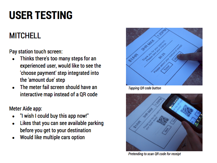
Overall, my user testers completed the process quickly and without difficulty. The only pertinent changes I will have to make are small—like rearranging the placement of buttons and changing wording—before moving on to adding color and supporting graphics next week.
There were some great suggestions, like adding a responsive voice to my pay station interface, however, I don't currently have time left in the quarter to add any features.
With the improved pay stations, following the touch screen’s directions makes paying for parking simple, even for users familiar with older systems. And if your city has the full sense-and-pay system installed, you can park, pay, and walk away with little effort.
The improved pay stations (with optional sense-and-pay system) take the stress out of parking.
With the Meter Aide app, you can do this all in the palm of your hand. You can find the best parking option with the Parking Map, then Check In and pay while staying dry in your car. You can even secretly feed the meter during the movie if the time is about to expire.
The Meter Aide app takes the stress out of parking.
To create a system that improves upon existing systems.
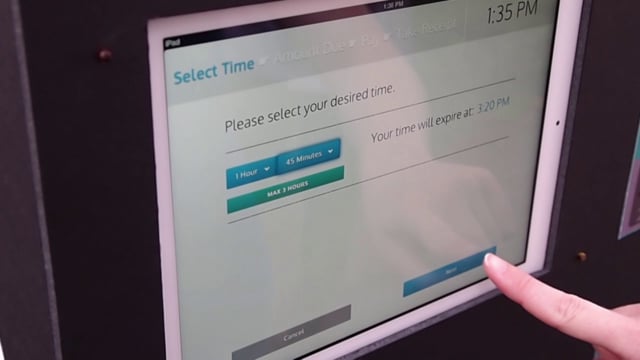
The linear process guides users through paying, so error is minimized, and allows the user to move backward and forward until payment is input into the machine. The touch screen combines both instruction and function, thus chunking the information into manageable pieces for the user.
The system is based on time selected instead of amount of money input into the machine. Hopefully this reversal will be beneficial and prevent users from inserting money into the machine first if the linear process fails. The time is based in five minute increments, allowing for more flexible time selection. The machine also dispenses change, something that pay stations currently do not do.
The accompanying METER AIDE app allows users to skip the pay station, and pay from their car through the power of GPS services and a pay-by-license system. The process is similar to the pay station’s flow, so the if the user frequently used both, they could transition back and forth easily. A combination of a map and countdown clock is used as a reminder.
Wouldn’t it be easier if the pay station knew where the user parked automatically?
Wirelessly connected vehicle sensors embedded into parking spaces constantly update a database with current parking availability information. This data can be used for parking availability maps, for both users and parking enforcement.
When a car parks, the database is updated with the location, date, and time. By the time the user interacts with the pay station the system makes the connection that the user belongs to the vehicle parked – There's no need to enter a parking space number, the technology works in the background. In a high volume situation, the right sorting algorithm can match each payment with each parked vehicle.
In my interface, the user is led through a step-by-step process to minimize the potential for user error and information overload. I am also creating a pay station skeleton out of foam core and paper mock- up pay station parts for my final user testing sessions.
I am also creating an accompanying app prototype for iPhone that follows a similar flow. Instead of using the pay station, the user can check into a space without leaving their car to pay. The METER AIDE app concept:
Users will initially create an account through the app with their car registration information and a valid credit card number. This information can be updated through account settings, but is not needed for everyday use.
When the user parks, they will ‘check in’ to the parking space and authorize payment for how long they wish to stay. A user cannot check into a space without being physically parked in that space. The user will receive notification that the payment was accepted in-app and can send an optional digital receipt through email. After purchase, the user can view a screen that shows the remaining time and the receipt summary. Users can also set a time remaining reminder.
Once leaving their car and proceeding with their day, if set, the user will receive a reminder before time expires, prompting the user to refill the meter if they desire. Spaces that have time restrictions will be limited to one refill to encourage parking space turnover. Once the user returns and leaves the parking space, the vehicle sensor will automatically show that space as open in the system.
Creating the two interface app files through PhoneGap and plugging in my framework HTML went smoothly since I had taught myself how to do it in a previous class. Working within Xcode, I could easily see how my code would render on an iPhone and an iPad through emulation. This helped a lot with placement of buttons and font size, as I can get a better feel of the device screen size. Although, what helped the most in figuring out button size was watching users during the final usability sessions. Figuring out the look and feel of certain aspects of my two interfaces took some time since I had to push a chunk of my schedule forward to meet the unit requirements, but since my goal was to have them mirror each other—the smartphone app almost literally being the pay station in the palm of the user’s hand—I ended up copying and pasting a lot of code. In the end I finished the alpha version of my project with just enough leeway to not go through a burn out, so when I went back to make any changes after the final user testing sessions, it was a smooth process and I didn’t dread it.
Google Maps API is easy to use, as long as you understand JavaScript. Something I didn’t intend on using from the beginning was an embedded custom map. I really wanted my parking map to be interactive, and not just a static image of a map that I manipulated with code. I serendipitously came across an example in jQuery Mobile’s demo pages where a normal Google map is embedded into an <iframe>. I quickly read up on Google Maps API and discovered that I could easily create my own .html file and customize the look and feel of the map. While it was a risk to learn something new, it turned out to be easy and fun. In the end, I probably saved time and lines of code, and my parking availability map appears like it’s actually functional.
Making my pay station was a great break from working on the computer, and it only took a few hours. The only real annoyances were getting the uncut foam core boards to my car from Blick, getting the boards into my small car, and during the user testing the duct tape I’d used to hold some of it together melted in the heat. The fun outweighed any of the annoyances!
For my final presentation, I scripted, filmed, and edited an explainer video for my prototype app.
If you would like access to my main documentation (93 pages, .pdf), don’t be afraid to ask! It includes all of my research and reflections while working on this project—connecting the dots I’ve laid out here.
As of 2018, the City of Savannah has an app that lets the user feed the meter remotely. I use it all the time!!