


RiffRaff was a sharing economy startup with the concept that the average user could make money by offering lessons sharing their hobby, or pay others to learn something new, all on the fly.
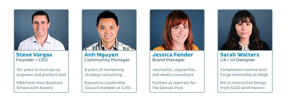
With a shared understanding that UX is the most important aspect of product design, the CEO and I made an effort to make the RiffRaff platform user-friendly and accessible right from the start. Funded for the next few months, the company grew to a small team of four. My role was to work on the design of the product, brainstorm new ideas, co-create the brand, draft pitch decks, perform user tests, and participate in field research. After a few months we had a fully live beta version of our product and selectively onboarded our first few users. Unfortunately, by the end of the year, we did not recieve another round of funding and the company shut down.
As a junior designer fresh out of an internship, and living in San Francisco, I wanted to work for a small startup. I flipped the job application process and posted on Craigslist that I was looking for work experience and had several responses.
The job opportunity that piqued my interest the most was a sharing economy startup called RiffRaff, with the mission to connect people looking to share their talents, or grow by learning something new. We would help people “do free time better”, and hopefully earn a little money on the side.
I interviewed for the job by performing a design test to show I can think critically and have passion for designing a UI and experience, then meeting up with the CEO for an in-person interview.
In the design test below I had to create wireframes for the homepage, and what it might look like as a user to search for something to learn.
Since I was the only designer on the team, and one of the first team members hired, I had the opportunity to shape the brand, as well as design the UI.
One of my first tasks was to redesign the logo, since the old design did not make sense: two people shaking hands from above, that sort of look like two lowercase letter r shapes. The CEO was attached to the idea so I tried several different iterations, but ultimately we settled on a more obvious, but still abstract handshake logo.
Simultaneously, while working on wireframes and the user flow for our platform, I worked on fleshing out the basics of branding, like colors and team t-shirts. I also helped design basic marketing assets like flyers to print and post around the city.
These design decisions were a great break from getting too focused on one project, and I liked being able to jump back and forth.
While re-designing the homepage, we took advantage of online UX tools like Peek by UserTesting and Usability Hub. Since I had multiple projects to juggle, it was very convenient to be able to do remote user tests.
After several weeks of iterations of the homepage, we finally settled on a design. I took the photo for the hero image, deciding to stage it in one of San Francisco’s most iconic parks. From there the user could play with an interactive map and scroll down to learn more about RiffRaff.
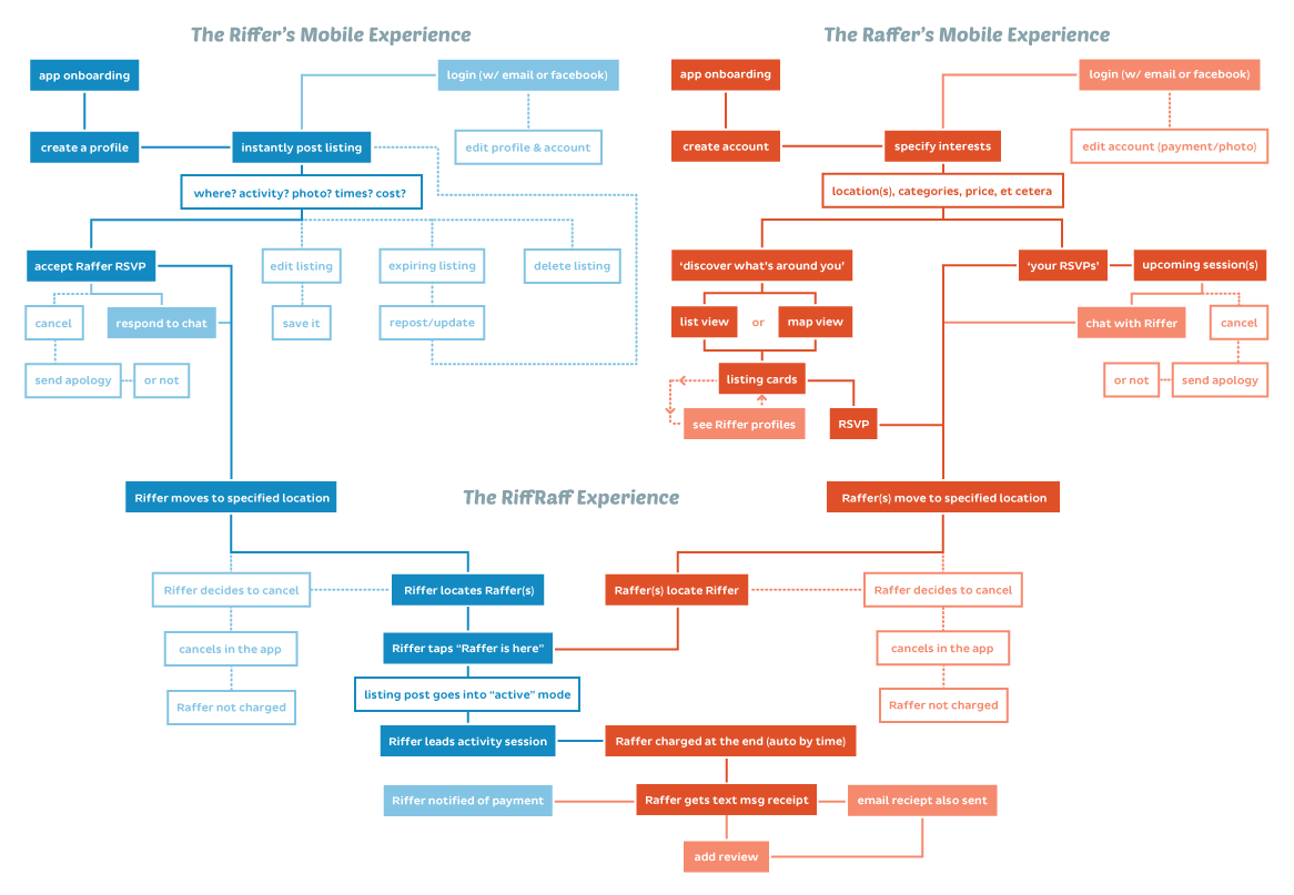
While we were getting ready to start opening up our beta platform outside of our core members that we onboarded by hand, I worked toward nailing down the ideal user flow for both the app and the overall platform experience.
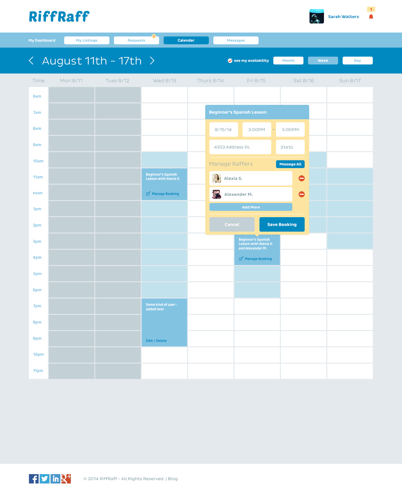
Figuring out how to handle scheduling was our biggest nightmare, since there are endless edge cases than can creep up that might deter someone from coming back to the platform. We went through several iterations of calendar designs, before settling on something more serendipitous for the user—the instant post scenario—where a post would stay up for a limited amount of time and then disappear. The method of posting became tightly controlled, a fill-in-the-blank form, to keep us from having to moderate each posting. We also added the option for members to chat to each other inside the app in case there were any issues or cancelations.
Our ideal scripted experience allowed someone to be able to create their listing on the fly while they were sitting idle, or even walking down the street. They’d be able to finish posting a listing in a few short minutes and get almost immediate feedback whether or not someone would book their listing, so that they don’t waste their time. This relies heavily on the assumption that people in general are spontaneous and looking for something to do, rather than strictly planning out their week.
Once we had more of an idea of what we wanted the mobile experience to look like, it was time to iterate on the wireframes, with lots of note taking in the margins. Nothing was left to the imagination, I didn’t forget to wireframe empty states, too, in case there was a missed opportunity to do something interesting.
Besides scheduling, creating a set of core categories was challenging, because they could technically go on forever, and we did not want to leave anyone out. It was very hard to predict everything, but we tried our best.
Each parent category could have seemingly endless sub-categories. Using both music and food as examples: Music could encompass learning to play an instrument, to songwriting, to fixing a guitar. Food could encompass everything from learning to shop for healthy food, to learning about traditional Ethiopian food, to getting help with converting to a new diet and learning new recipes.
It was very hard to make time for user testing while juggling wireframing, mockups, and meetings, so I learned to create very simple A/B tests on UsabilityHub to get some basic insight into what kinds of designs users might prefer.
After wireframes were finalized, I made several pixel-perfect mockups to turn into clickable prototypes at pitch meetings and whenever we wanted to show off a demo of our platform, while it was in beta. Having our first onboarded members use the beta version of the platform gave us tons of user feedback on where we needed to iterate.
Early on, I created an interactive Google map to be used on our homepage and dashboard for users to explore a stylized map of the neighborhoods of San Francisco. Most people who live in San Francisco feel tied to their neighborhood, or are drawn to certain neighborhoods’ personalities, after living there for a while. The map was a way to show where a service was being offered, while still being vague enough to provide anonymity.
Once we launched the beta, each of us spent time picking through the interface ourselves and tried hard to break it and find bugs. We kept track of each bug or issue we found on Trello. The interface wasn’t 100% finalized and wasn’t perfect, with hiccups like duplicate emails and utilizing default dialog boxes to start, but it was a huge accomplishment for only a few months’ worth of work.
Below are some of the final mockups for a user browsing around to book a service. The user can choose from the main categories, then narrow it down to subcategories, or choose to look at the map to see what is nearby. When inside a category, users can see listing cards with a basic description and can choose to book from there.
Below are the final mockups for a user posting a listing for a tennis lesson, complete with a peek at their profile, a notification when their lesson is about to expire, and what it looks like when a lesson is booked.
Below are mockups for what it looks like for the user if they want to manage their listing for a tennis lesson. They can chat with the person that booked their lesson, such as if that person is running late.
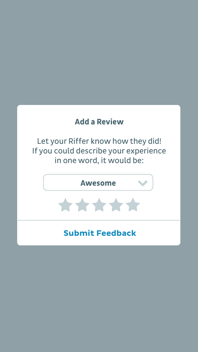
The “one word review” was a way to simplify and condense the review process for users and was a feature we decided on very early on in the design process. Users could choose from a pre-populated list of adjectives to rate their experience.
Dauntless.
In the end, we did not receive a second round of funding, so work on the platform stopped. I learned a lot while having to wear multiple hats and I would not trade my experience at RiffRaff for any other. It’s exactly the startup experience I was looking for, full of collaboration with a positive-minded team that worked tirelessly toward the same goal.
Challenges
As the lead designer, I had a tremendous amount of responsibility and control over the product. There was a constant stream of iterations as we moved very quickly through the initial design stages, and there wasn’t time for perfectionism. I had to get comfortable with different types of working environments and be able to pivot what I was working on based on feedback with no ego involved.
Outcome
While there was pressure and excitement to get our product to launch, it was never overly stressful because of how well the team worked together.
If you would like to see more work from my time at RiffRaff, send me an email.