


The Internet is littered with small business websites that have been built and left to deteriorate. Often, they just need to convert to simple, one page, scrolling sites that they can leave and forget about for stretches of time, if the content hardly needs updating.
This small business was in the middle of a name change and planned on switching domains, and they reached out to me for help, since they had not changed their website for several years. I started with sprucing up their logo into something that looks modern and more professional.
One of the most convincing ways to point out just how ineffective a website has become over time is to utilize Google’s free Test My Site service. Very quickly Google’s service creates a to do list for what needs to be done to get a client’s website functioning as best as it can.
First Impressions
● Not mobile-friendly, so Google has probably pushed the site further down the results page (Google has given preference to mobile-friendly websites since 2015—”Mobilegeddon”)
● Little content and old viewport resolution makes it difficult to view on mobile
● Outdated design; easy to modernize content
Plan of Action
Update content, add new content if needed
Structure content based on primary target user (Clearly define or re-define what your customers need to know about your company), sort of like:
a. About
b. Services
c. Products
d. Why/Testimonials
e. Contact
Figure out look-and-feel:
a. Does it need to look like https://www.agrofert.cz/
Reduce pages and create a modern, responsive one page website like:
a. http://talentatlas.net/
b. http://www.big6media.com/
c. http://tiny.website/
Launch
Retest website with Google to see updated metrics; tweak if needed
Header area not up to date with current web standards. Propose creating a responsive menu bar with the company logo in the top left corner.
Is “Global Chemical Solutions” the company tagline?
Propose scrapping left-column menu. Not necessary for a functional site.
Redundant company name text; only page the logo is on.
Propose condensing intro text into a more standard form.
Usually this is a big, bold tagline or short sentence describing the company—“We make widgets and gizmos for the smart-minded client.”
Followed by a short paragraph backing it up—“Insightful sentence on how we can help you with our widgets and gizmos.”
Propose linking to the English version of the site instead of the Czech version.
Info on Precheza can go in a new section (“Partners”, “Services”, “Plants” ?)
How much pre-existing knowledge of TiO2 does your target user have?
Propose putting this in an easier to read table in a new “products” section or sub-section.
Propose we treat this content the same as with Precheza.
It’s not obvious at all that the logo is clickable, but it does redirect to the English site.
Same as the TiO2 page.
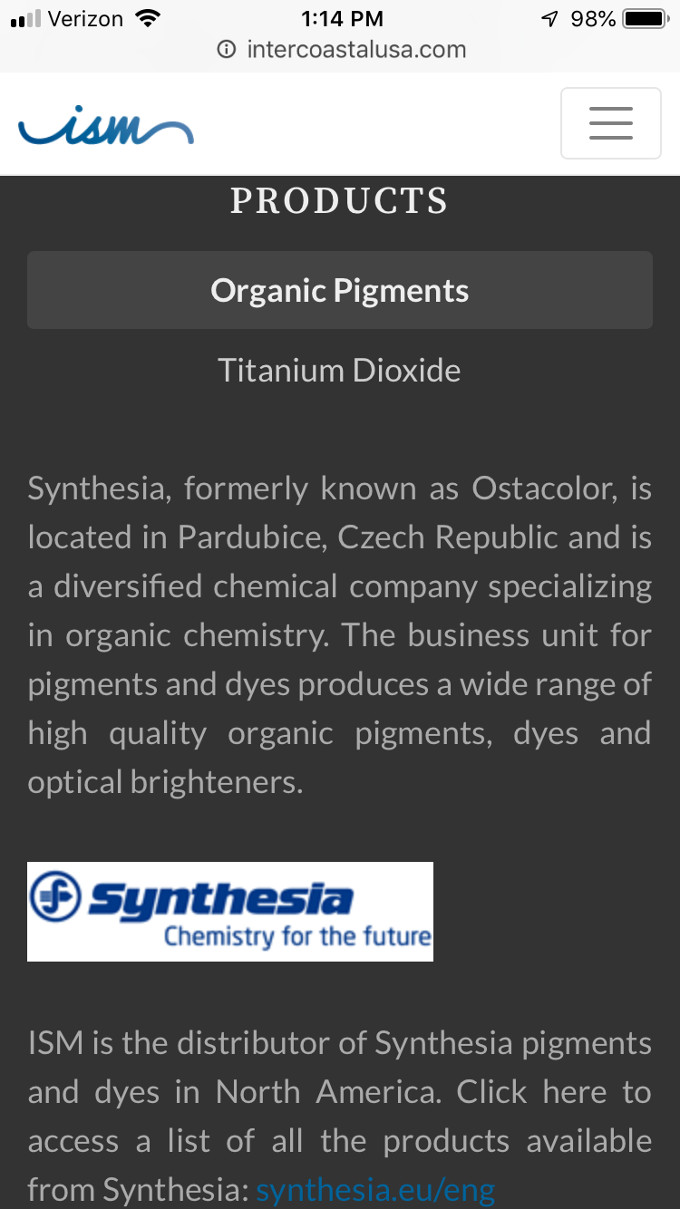
Propose scrapping this image (Google can’t read images for SEO); turn it into a table of products.
This logo isn’t clickable.
These products have broken links.
Is it necessary to link to products or just the company site?
Propose the same as the TiO2 page and Organic Pigments page.
This logo is clickable (but no English site available?); the products are broken links too.
This info can go in the very last section/footer.
Suggest making phone numbers into links (good for mobile/SEO)
Suggest putting titles (How do new clients know who to contact other than most would assume the main office?)
___
Final Thoughts
Is the website just an informational hub for different companies? Besides contacting you, there is no need for interaction other than clicking links to different websites with more information?
The website I designed for The Guild Hall was a single page site with “microsite” slides for each business under the Guild Hall name.
I can do a similar site map if that’s the case.
To future-proof the site (so you don’t have to constantly think about broken links), I suggest linking to other parent sites instead of individual pages whenever possible.
I do this on savannahmaritime.org so that the site is always accurate.
Completely rebuilt from scratch with Bootstrap and vanilla JavaScript, the new ISM website is streamlined to one page with three sections: about, products, and contact. The clients wanted customers to call them for more information, rather than list out everything on the website.
Above the fold is the new logo with some of the about text peeking through the bottom.
Simplified to two categories, the products section highlights organic pigments and different grades of titanium dioxide. Most customers viewing this information would understand what they were looking for, but if not, at the bottom of the section is a link, if they have questions.
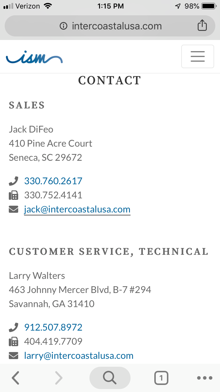
The footer has updated contact information, with links for phone numbers and email addresses. Instead of a map of locations, the clients chose to list out the cities where there are warehouses and offices.
Fully responsive, the site now renders smoothly across viewports, following the same flow as on larger screens.
Each section stacks into one column, making it easy to scroll up and down the page.
Check out the live site here: intercoastalusa.com
If you have any questions about this project, or would like me to design or redesign your company’s website, feel free to send me an email!