Spotlight Your Weird
As a part of AKQA’s Creative Technology Apprenticeship, I worked with the Target team to re-invent the digital weekly ad to help drive in-store sales. At that time Target had several apps, but wanted to consolidate them into a more seamless experience for their customers.

Brief & Process
In the beginning, I worked with other interns to brainstorm and come up with possible solutions, then we broke apart and worked on solutions individually. I created two potential looks for an online “feed” of items the user could choose from to build their shopping list. In addition, I added interesting things from Target’s social media like a fun Vine and a video from the YouTube channel. “Spotlight your weird” was my motto when working on this project—Target is a very fun and playful brand and I wanted to show that personality through the digital weekly ad experience.
During the internship, we were given freedom to choose our own projects. I chose to work with the Target team as my main project because I could easily do field research by walking down the street to the nearest Target store to observe customers, as well as because I am interested in learning about consumer behavior. AKQA provided the corporate style guide to follow, and I did my own research into the brand by analyzing their voice across social media. In between jumping around other projects, most of my time was spent hand-coding the HTML prototypes, which I then presented as part of my final presentation at the end of my internship.

Task: Re-Invent The Digital Weekly Ad
I worked with two other interns, Nate and Simon, at the beginning of this project on ideation, general brainstorming, and during the initial research phases. Once we started to collect enough information to each start working on ideas, I broke away to start prototyping.
To check in on our progress, we met with Alex, a more senior designer on the Target team. We made revisions based on his feedback and took his advice on where we should steer the project.
By the end of my internship, I created two web prototypes and one mobile prototype.

Research
Nate and I frequented the Target close by our office to take photos, write down questions, and try to get into a different headspace—as observers instead of guests*. Nate is Canadian, and had never experienced Target the way I have as an American, and instead only knew that Target failed during their expansion into Canada.
We wrote down all of our thoughts onto sticky notes, then organized them at the office.
*Target uses the word guests for customers. I heavily used information from corporate.target.com to get more insight into the brand!

Brand Mapping
After thoroughly analyzing the Target brand, I mapped out how the guest experiences different aspects of the store, on a scale from physical to digital, and social to personal experiences.
Unsurprisingly, as most big brands now have large e-commerce sites and apps, most of the experiences are tailored for a personal digital experience.

Guest Lifecycle
Something as mundane as buying toilet paper is cyclical, and everyone needs it! From the moment you realize you need to purchase something, to acting on that impulse, large retailers compete for your attention.
In a chart, I mapped out the guest lifecycle from the preplanning to the return home stage. Buying toilet paper most likely falls under the category of routine restocking, but guests visit Target for all kinds of shopping trips, from routine, like groceries, to treating themselves, like buying that gadget they’ve been eyeing, to once-in-a-lifetime, like setting up a wedding registry.

Guest Ecosystem
As I brainstormed ways to get the guests attention during their preplanning and shopping, I further mapped out the lifecycle of a Target guest into a circular chart.
I gravitated toward a system that a guest would have to sign up for in order to get some kind of reward for using the weekly ad, weekly. The system, over time, would learn the guests preferences and become a tailored experience. Points could be redeemed for a free drink at Starbucks, or $5 off. Guests could even create a wishlist to keep tabs on items they planned to buy or wanted others to purchase as gifts for them. The points only add up from in-store purchases, hopefully driving customers to stores instead of shopping online. More visits in-store would potentially drive guests to buy additional things off their list, too.

Social Media
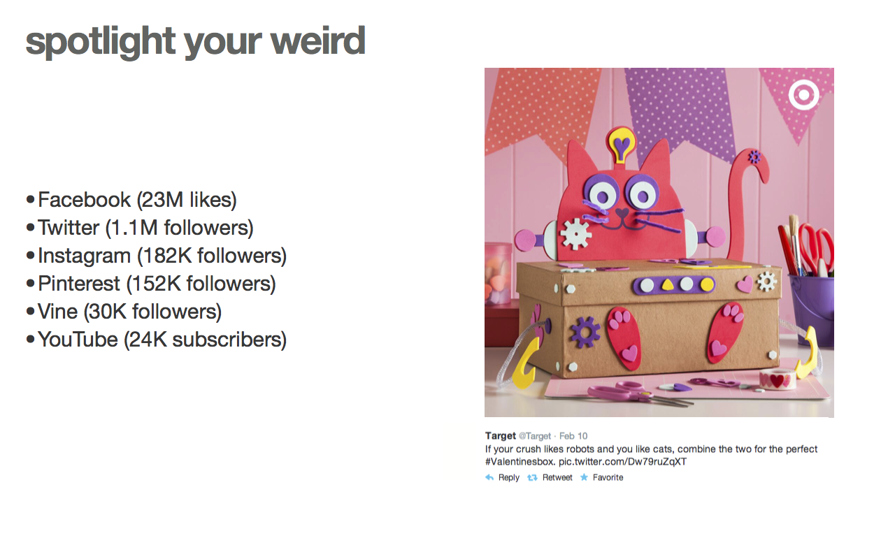
While doing research on Target’s web presence, I noticed they have a widespread social media audience, with clever, unique content, but this content was not a part of their website and app. In particular, the YouTube account had several short, eye-catching videos that were fun to watch, but the channel only had 24 thousand subscribers, compared to 23 million Facebook likes! Who were the videos made for and where were they shared?
“Spotlight your weird” became a driving force behind my project and I decided to use the quirky side of Target’s personality in my prototypes. Target could expand their social media presence by including content like 6 second reviews for hot beauty products, recipes for college kids, and include more tutorials like the cat-robot valentine project!

Innovation
The need for innovation was clear. Print is dead, and the current solution for digitizing the weekly ad was to have an interactive version of the print design, and it was not mobile responsive…in 2014.
Their competition (similar big box retailers) were doing the same thing for their weekly ads, so there was a big chance for innovation and setting a new standard for pushing weekly shoppers into stores.
What can I do as a designer?
Target’s ideal guests increasingly shop for experiences over things. It’s the basis for retail therapy; shopping gives most people good feelings—a hit of dopamine. If the weekly ad inspires guests to shop at Target, carefully tailoring the weekly ad experience to them could create a positive cyclical experience, by making Target the guest’s preferred retailer. To further integrate into the guest’s experience, Target should highlight their lifestyle content, like recipes, beauty how-tos, and other related social media content, and connect it with what’s on sale each week.

Dynamic Weekly Ad
The first prototype I built is a dynamic grid with expanding blocks of content that encourage the guest to interact.
If they recognize a product, like the carton of eggs, they can click or tap the circle to check it off and add it to their list. But, if they need to learn more, or interact in a different way, they can expand the content block to learn more, remove an item, or like an item. Over time, this system would pick up on the guest’s shopping preferences, showing them categories and specific items they love. Sprinkled in would be content from Target’s social media, providing small dopamine hits, and maybe persuading the guest to interact with the brand online.


Scrolling Weekly Ad
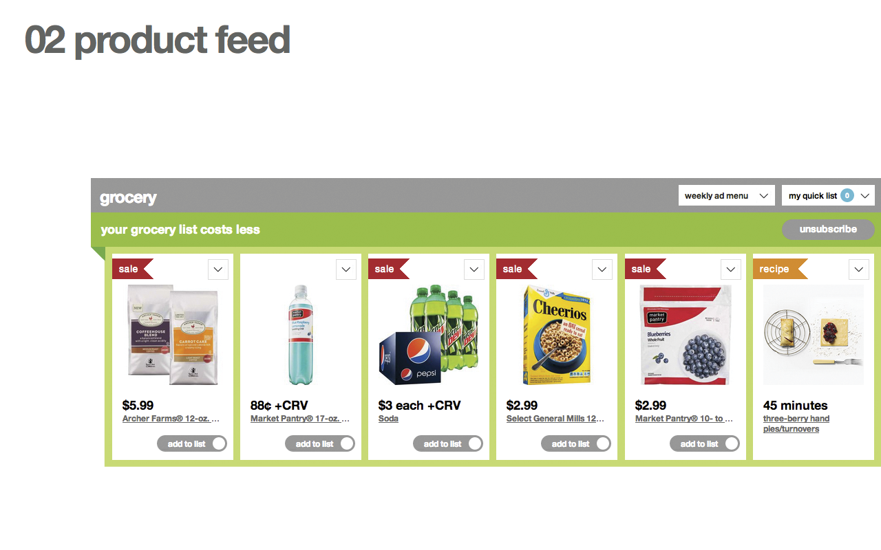
This iteration of the new weekly ad concept is an interactive, customizable feed of products, chunked based on the current categories in the physical weekly ad: grocery, women, men, kids, etc.
Guests can customize their weekly ad feed by first selecting what kind of lifestyle they live—a single person would not necessarily need to see baby items, while a family would. Someone living a vegan lifestyle may not want to see recipes for brownies, unless it did not include milk and eggs. From there, guests can select specific interests like fashion, electronics, books, pet care, and more, so they only see products they’re interested in purchasing. Once the guest has customized their feed, if any products they don’t like slip through, they can click on the individual item to remove it from their feed. Or, they can say they love that item!


Internship Post-Mortem
If you would like access to my prototypes, please send me an email! They may not render as nicely across browsers as they did in 2014, but they still look great in Chrome.
Challenges
Working as part of a large company with many interesting active projects was a first for me, so I had to initially get over the shock of “analysis paralysis” and jump in. I was assigned a mentor, but he was busy with his own workload, so it was up to me to be independent.
Outcome
My three months as an intern were stressful, but fun. The most fun was participating in a 24hr hackathon, where we created a pitch to improve the app HelloSMS.
